In the world of graphic design fonts—or typefaces, if you prefer to consider variations within font families—are out-and-out visual alphabets and make up the very essence of text. Each letter, from A to Z, can assume its unique personality and acquires its peculiar visual ‘voice’, thus putting across much more than just plain words.
Fonts are characterized by their style as well as by their proportions, their shape and details, and the thickness of their elements. Some are bold and punchy, others are look elegant and polished; some suggest youthful ebullience, others are imbued with a sense of tradition.

From streamlined, minimalist sans-serif to classical, sophisticated-looking serifed fonts, they all have a role to play. Some typefaces seem to whisper, other seem to shout; some look grave, some look cheerful—fonts certainly have a marked impact on communication. By means of their shapes and lines, fonts can create a unique ambiance and add a distinctive appearance to the word they display.
Fonts are hidden marvels that may turn a run-of-the-mill document into the cat’s pyjamas, making even commonplace words look magic.
How to choose a font
Choosing the right font for a project can really make the difference. The same design might look average or outstanding just because of this. Let us examine some of the aspects one has to consider when selecting a suitable typeface.
First and foremost, think about the message you are trying to get across.
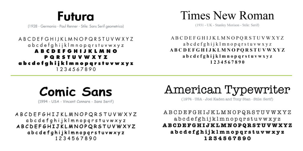
Would you like to convey an aura of professionalism, you might opt for a classical serif typeface. If your aim is rather a modern, minimalist image, then a sans-serif font, such as Helvetica, Arial or Futura, may be a better solution.
For something more formal, why not choose Times New Roman or Georgia.
On the other hand, if you need to suggest a creative, playful feeling, more decorative font, perhaps a ‘script’ or a ‘display’ typeface might be just what is needed—try Lobster, Brush Script or Comic Sans.
Finally, to communicate style and refinement, you could hardly go wrong using a stylized serif or a sophisticated script like Bickham Script or the good old Bodoni.

Never neglect legibility and readability: your text should be easy on people’s eyes as well as easy to understand, whatever the size and background. Moreover, fonts should not clash with other elements. So do avoid whimsical typefaces and refrain from using hard to read ones too, particularly for body text.
Do not use too many different fonts: within any given document, one or two accurately chosen and well matching fonts represent an excellent choice.
Remember that consistency is paramount: the typeface you pick should always be in line with the overall design. Trend awareness is important, yet do not allow them to divert you from your goal. Choose a font suitable to match the global effect towards which you are working; this is the only way you will attain a spot-on unique design.
A proper choice of fonts can substantially improve the impact and appearance of your documents; it will also prove much more effective in conveying the underlying message. Trust us to make your text and logotypes even more enticing!