For any business, a logo is a cornerstone of all marketing and communication strategies. A distinctive and recognizable element, it is their signature, their business card, as it were. Therefore beneath its outward graphical appearance there must be a painstaking investigation and a detailed analysis, involving corporate positioning, the relevant target, and naturally the message they wish to impart.
A well-designed logo, fully in line with the company’s core business, will lead to greater customer loyalty and make the brand more easily recognizable. This is why designing a logotype or a logomark is part of a wider business strategy framework whose object is to convey the very essence of the brand to any potential customer.
Of course, over time that same essence might well undergo a number of transformations, such as those caused by a different scenario or a mutated management policy. As a result, their logo shall have to undergo alterations, too—evolve and adapt, rather than remain unchanged. Such alterations are described by the therm restyling; quite often, this will be closely connected with rebranding.
But let us take a step back…
How to devise an effective logo
Whenever a logo is called for, a brand identity must also be defined, taking in how the company intend to communicate their vision, their mission and their values to their target. A well-defined brand identity is crucial if we want potential customers to recognize the brand as soon as they see the logo—and automatically start thinking of the products that bear that brand. Thus a logo should encapsulate all the elements which make up brand identity.
That done, we can move to the graphic designing stage. A monogram, a pictogram, a crest, a wordmark: in principle there are many possible choices, so we must analyse the company’s competitors and the industry as a whole in order to identify the most appropriate, the one most likely for a given target.
The next step would involve choosing a typeface, namely, the design of lettering, and a colour palette. One must remember that our brain tends to associate specific moods to specific hues, so knowledge of consumer psychology is highly beneficial.
Our purpose? A logo must be iconic and unforgettable and so favour brand loyalty and customer bonding, winning their hearts and minds by meeting their demands and expectations.
Major criteria to take into account in order to develop a highly effective logo include:
• it should be easy to notice and remember, so it must be simple enough, yet never commonplace;
• it should convey a message—one matching the company’s values;
• it should be easily recognizable in all its forms and variants;
• it should be suitable for use with the various communication channels employed by the brand itself.
Rebranding or restyling: it does make a difference
You probably changed your look in the last ten years, didn’t you? The same reasons can be said to apply to logos: they have to keep up with the times and evolve to respond to the changes they bring about.
This process is called restyling: a kind of communication whose aim is to rejuvenate the image of a brand to revamp and modernize it. It is a comparatively mild job, intended to review and update the graphic aspects of a logo in view of relevant changes which may have occurred.
However, sometimes a company may undergo much deeper transformations—maybe to refocus on a different mission, to reposition in order to target a changing market, to follow new trends, perhaps even to adjust to a merger with a different company. This calls for rebranding rather than restyling: one needs a full-fledged strategic marketing initiative, designed to modify the way consumers tend to perceive the brand by altering its very appearance. In this case our aim would be to reposition the existing brand, which implies devising and implementing an entirely novel corporate image.
In both cases, one must always preserve consistency with the core values of the brand, so as not to bewilder consumers.
A few examples
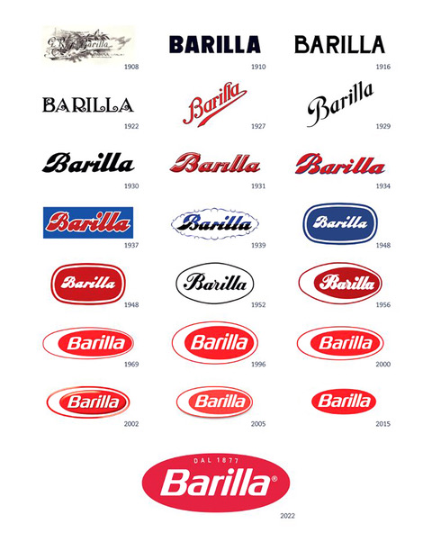
Barilla, the well-known food company, altered their logotype countless times since the company was established. In the new version, the two horizontally symmetrical ellipses and the inner white space, originally meant to recall the yolk and white of an egg which has been cut in half—and therefore connected with the origins of the brand—have been dropped. Additionally, the new logotype has been cast in a vivid red hue, regarded as better suited to convey a more accurate image of the broad range of Barilla products and the way they meet the ever changing requirements of consumers, an example in case being whole wheat pasta and gluten-free pasta.
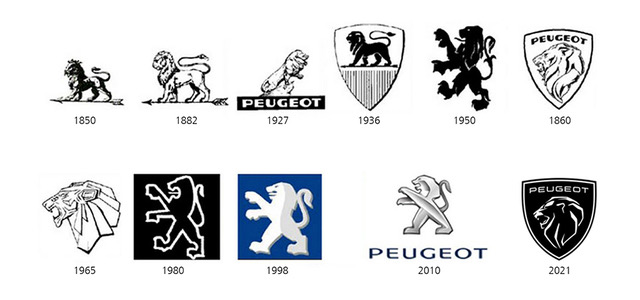
The logo of the French car maker Peugeot changed a number of times since 1850, but always remained consistent with the company’s brand identity. Dropping the lion rampant in favour of just a lion’s head in a shield may look like some sort of revolution; as a matter of fact, it is rather a question of going back to the roots, as shape and concept recall the company’s past: they look very much like those in use from 1960 to 1980. A logo destined to last for along time, then, while still preserving Peugeot’s iconic lion.
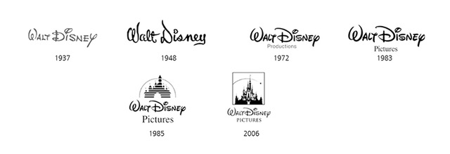
While the Disney logotype underwent fewer changes through time, it has a unique feature: it was essentially designed as a wordmark intended to represent Walt Disney’s autograph, and so was more or less unchanged until 1972. Later on, the by now well-known ‘fantasy castle’ was added; further changes in colours or other details were developed for use in different products (cartoons, etc.). This can be seen as evidence of this brand’s great strength as the company appears to be able to articulate their corporate image over the years without having to alter their logotype.
If you feel the need to freshen up the look of your brand, do get in touch with us and we shall help you find the best solution for your company.